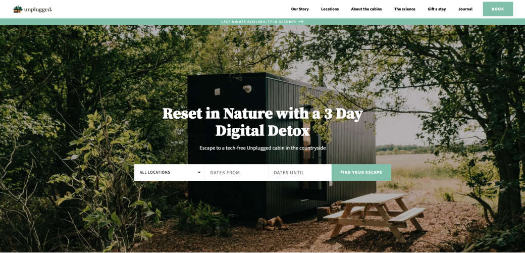
Minimalist modern cabins just an hour or so from city life. Carefully placed in the beautiful British countryside.
During my bootcamp at Memorisely we had the opportunity to redesign the website for unplugged.
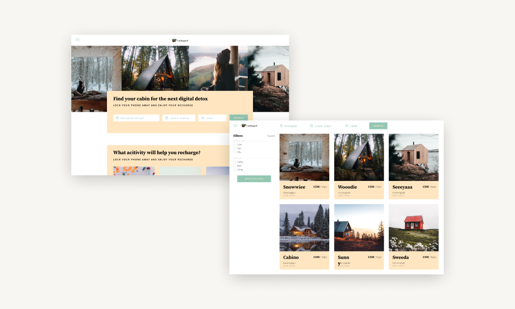
When searching for cabins, users currently filter through a series of drop-downs to find a cabin. It’s not obvious for users which months are available and ideally, they’d like more flexibility when searching and booking a cabin.
To solve the latter, I have adapted the website to match the classic booking platform in terms of layout, navigation, and hierarchy. When it comes to functionalities, the changes were strictly limited to the search such as adding filters and improving the information architecture of the pages.
The lo fi prototype helped me recognize frustrations with the experience that I improved at the hi fi stage. To create the high fidelity prototype I inspected the products style and followed the 8pt rule to effectively and easily create a prototype that was consistent with the product styling. Before creating the prototype I defined styles and components to easily and quickly help me design consistently
Below is the final version of the prototype that I created. I included interactions and transitions from Figma to match the products flow.
